Craigslist Rebrand, a Two-Day Design Sprint
The Challenge
Rebrand Craigslist and create a simple, new branding guide in 48 hours.
Table of Contents
- Introduction
- Re-Discovery
- Problem Definition
- Ideation
- Creation
- Resources
Introduction
Craigslist over the years
Craigslist was founded in 1995 by Craig Newmark, around the beginning of the dot-com bubble. The website has not changed much over the years; Information architecture has remained virtually the same and visual design is arguably non-existent.
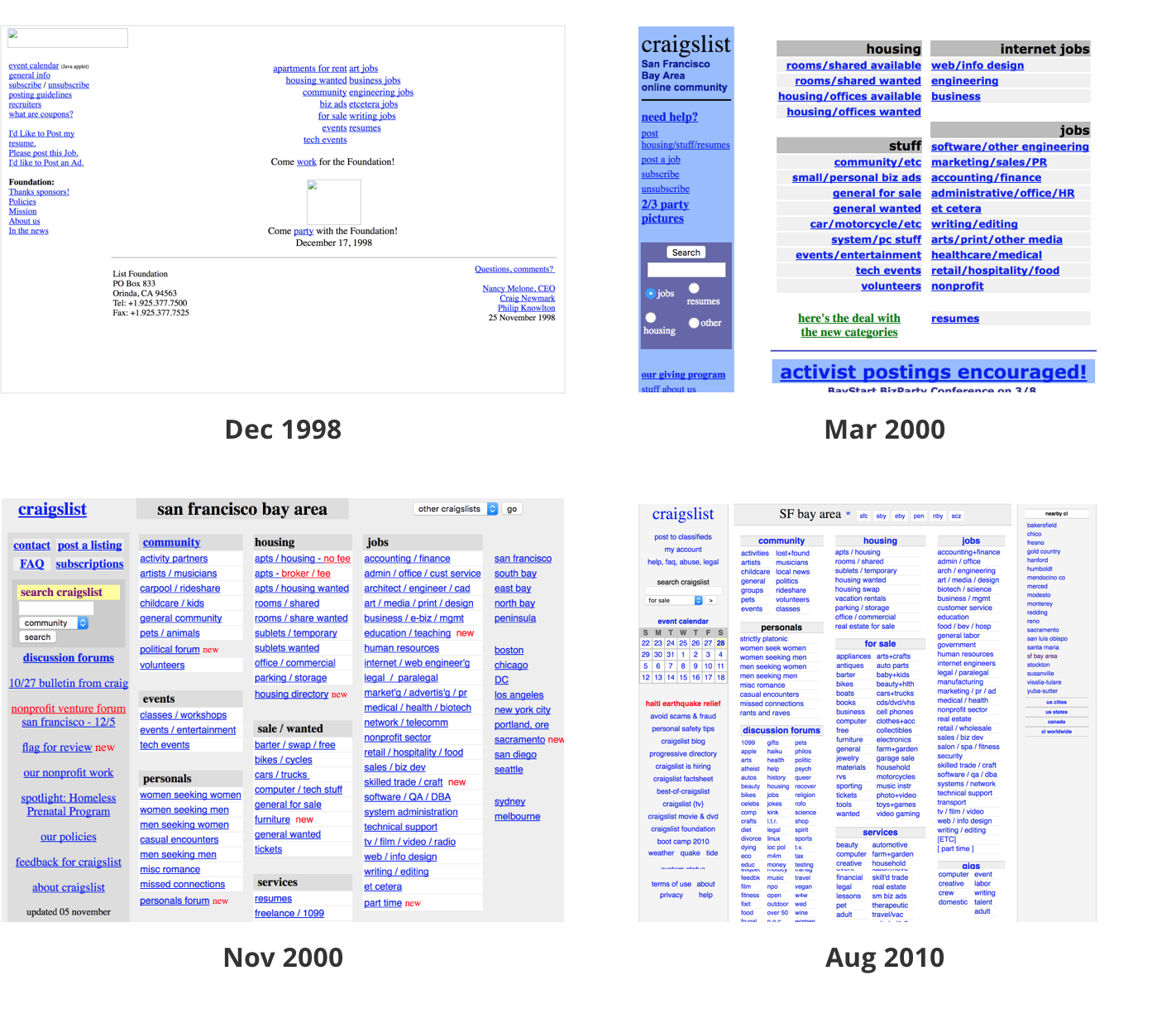 Craigslist’s site in 1998, 2000, and 2010.
The logo is reminiscent of a 1990s-style previously-visited link.
Does Craigslist need a rebrand? What would it look like if it did? I spent a couple of attempting to answer these questions on my own. I conducted some research on Craigslist’s brand, gauged users’ impressions, explored solutions, and crafted a simple, hypothetical redesign on their brand.
 My process used to do a quick Craigslist Rebrand.
Re-Discovery Phase
Stakeholder Interview Questions
It’s important for anyone getting involved in a project to understand as much about it as possible: Why are we rebranding? How will we define success? Who are our audience and our competitors? How long will this take? What restraints do we have? And so on. Expectations, hopes, and fears are also important to take into consideration.
As this was a hypothetical rebrand, I wasn’t able to sit down with actual stakeholders to conduct interviews. However, because it’s crucial to consider scope, goal definition, and empathy for stakeholders, I developed a checklist of questions that would be asked if an interview were to happen: Craigslist Stakeholder Interview Checklist
Users’ Impressions
It’s important to understand how your brand is being received by your audience. I reached out to both frequent and non-frequent users of Craigslist and asked them one question:
What is your immediate impression of Craigslist?
Here are some of the things they said:
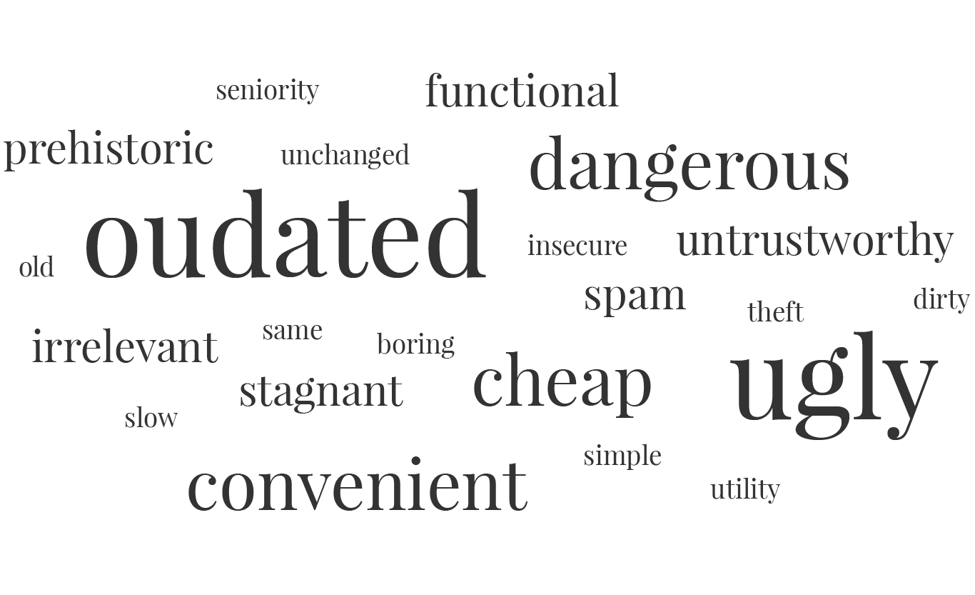 Words respondents used to describe Craigslist.
On the positive side, users thought Craigslist was convenient and functional (i.e. provided ways for them to get certain tasks done). It was also familiar and recognizable.
On the negative side, users thought Craigslist was outdated, ugly, and becoming a thing of the past. Users were not excited about Craigslist. And what’s a bigger concern is that users associated it with danger and untrustworthiness.
Prospects aren’t looking too good. What can we do?
Problem Definition
The Questions
Considering the feedback given by users about their impressions of Craigslist, I identified a few problems that needed to be addressed. Please note: If this were a real rebrand, further user research would be conducted to answer these questions.
Problem 1: How do we reverse these negative associations users have of Craigslist?
I narrowed it down to a few words that counter the negative ones and describe a more attractive personality:
- Modern
- Safe, Trustworthy
- Energetic, Fun
Problem 2: How do we make users feel good by using Craigslist?
That is, how do make users feel positive about themselves, their experience, and dispel issues or fears around safety? How might we increase the product’s perceived value to counter its image of being cheap and spammy?
Problem 3: How much do we need to consider users’ discomfort with change?
That is, how excited or frustrated might users be if we changed our brand? Will they enjoy it right away? Or will it be shocking to the point of discontinued use? Or maybe they’ll begin to enjoy it more once the initial shock wears off?
Sidebar: Could a lack of brand be the brand?
Possibly. Some may say Craigslist lack of visual design is a poor choice, one that suggests laziness or lack of attention.
One might also argue that it was a deliberate and business-savvy choice. Because you rarely see this kind of “style” anymore, Craigslist has become easy to recognize and can arguably be coined as its own unique style. And because of its simplicity and lack of changes, Craigslist doesn’t have to spend a ton of money each year on designers, strategists, etc. to keep up with the every changing design environment.
Ideation Phase
Mind-Mapping Personality
I began exploring different traits that could potentially describe the new-and-improved Craigslist brand. My brain’s train of ideas were poured onto a mind-map after deciding on three main categories:
- Classifieds
- Energetic
- Safe
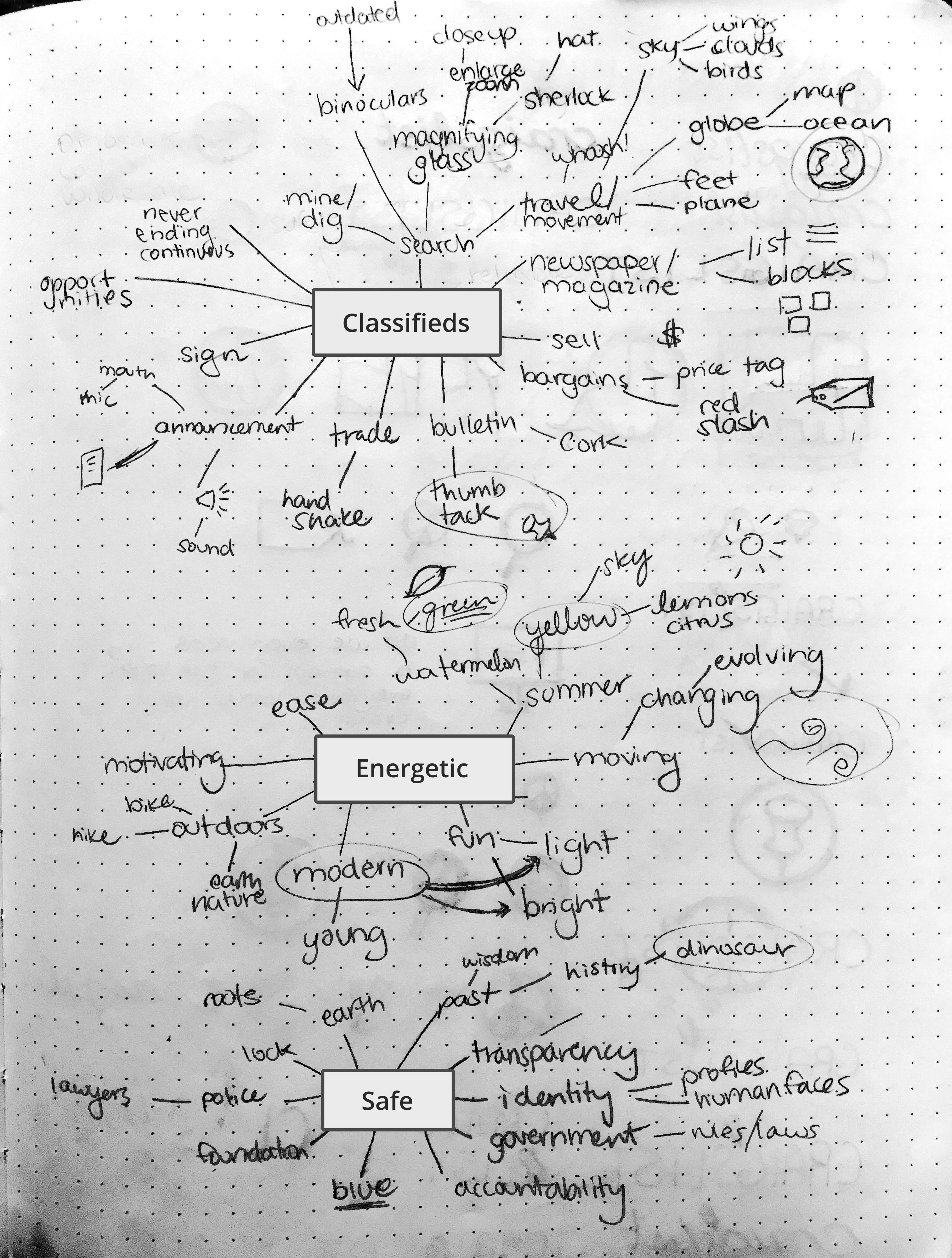 Mind-mapping possible personality traits of new brand.
Items 2 and 3 were imported from the list of counter words in the Question-Storming stage. “Modern” weaseled its way into the “Energetic” map.
Item 1, however, has not yet been mentioned. I chose “Classifieds” because it accurately describes Craigslist’s core service and function. That has always been its service and always will be. Additionally, with all the changes happening, it’s important to stay grounded in the company’s services and purpose.
Logo Exploration
I found a few interesting concepts from mind-mapping. Sometimes concepts look good on paper, but might not translate visually with ease. So, I sketched some of these concepts out as logos to get an idea of how it might carry over.
One interesting concept that came up was “Dinosaur.” Hmm, I thought. People find humor approachable, and this could be a cheeky way to poke fun at ourselves for being “prehistoric” and “old.” It was a mindset of using what we got to our advantage. So, I explored that.
I also explored a thumbtack to mirror real life listing on a bulletin board, a magnifying glass to suggest searching listings, various letterings, and their original peace sign.
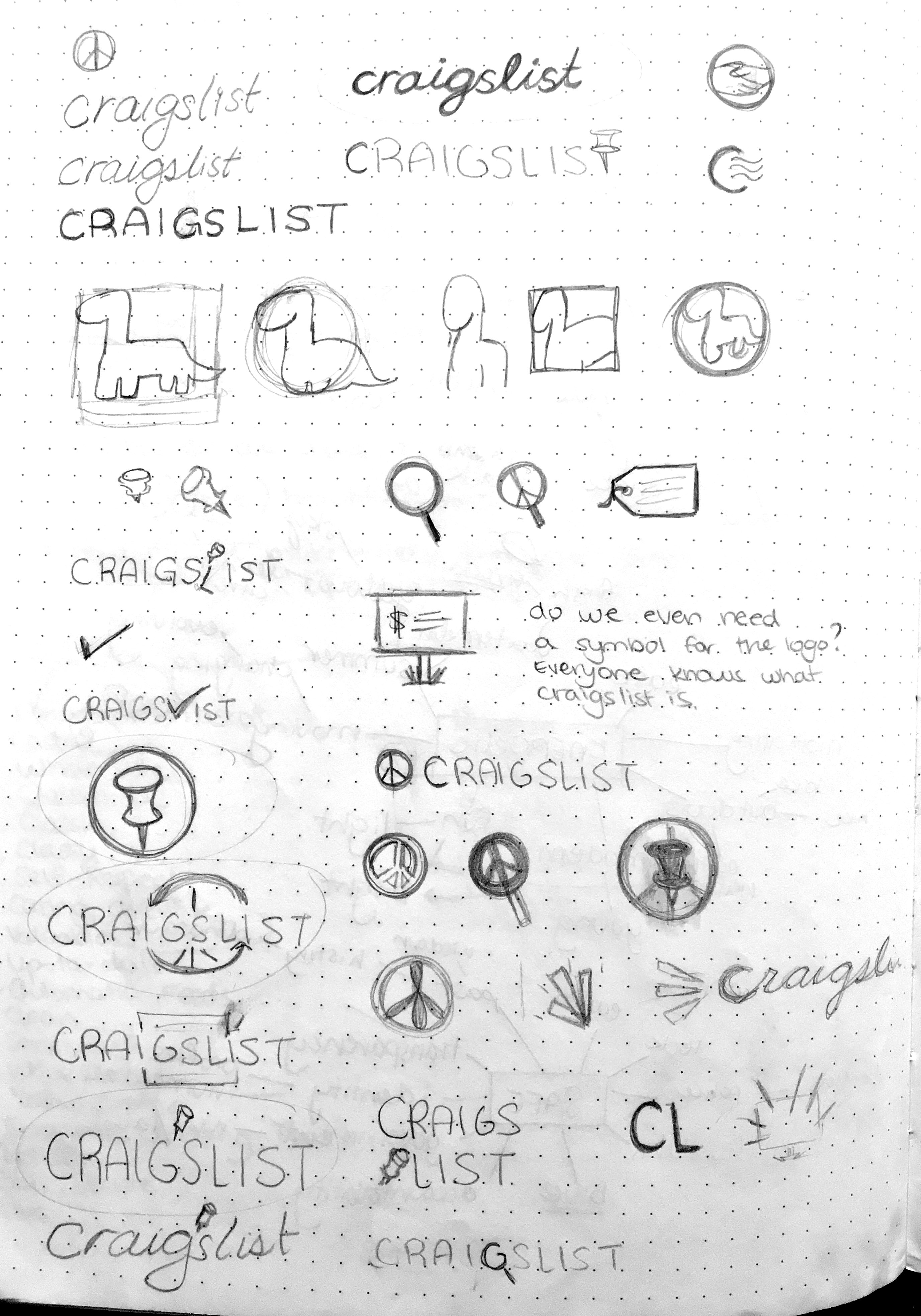
As I sketched this, a notable question sprung up:
Is a visual symbol even necessary for a logo?
Am I forcing an element into something that is highly effective on its own? Besides, Craigslist is highly recognizable; The name stands out on its own.
Additionally, it might be more effective to keep Craigslist’s original peace logo rather than introducing a new one, despite the ironic association to danger.
Creation Phase
The Branding Guide
The resulting Branding Guide is by no means a comprehensive, finished, or polished one, due to the limited time I set. However, it’s enough to get the idea across. Check it out!
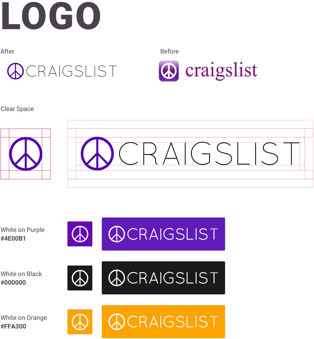
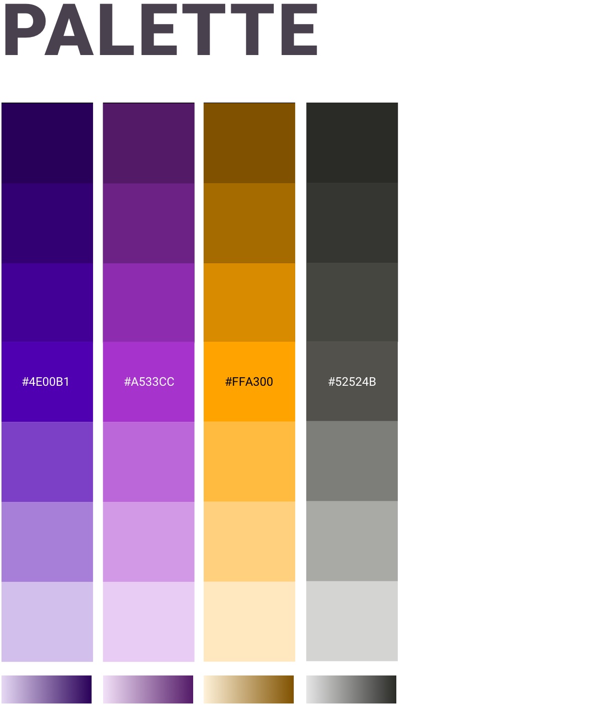
Utilizing the themes of being energetic, modern, and safe, I selected Orange and Purple to be its main color schema.
Purple was chosen because of its easy transition from the old purple logo and abilities to communicate sophistication, suggest increased in perceived value, and engender a feeling of trustworthiness.
Orange was chosen to contrast purple and bring a sense of energy, playfulness, and creativity.
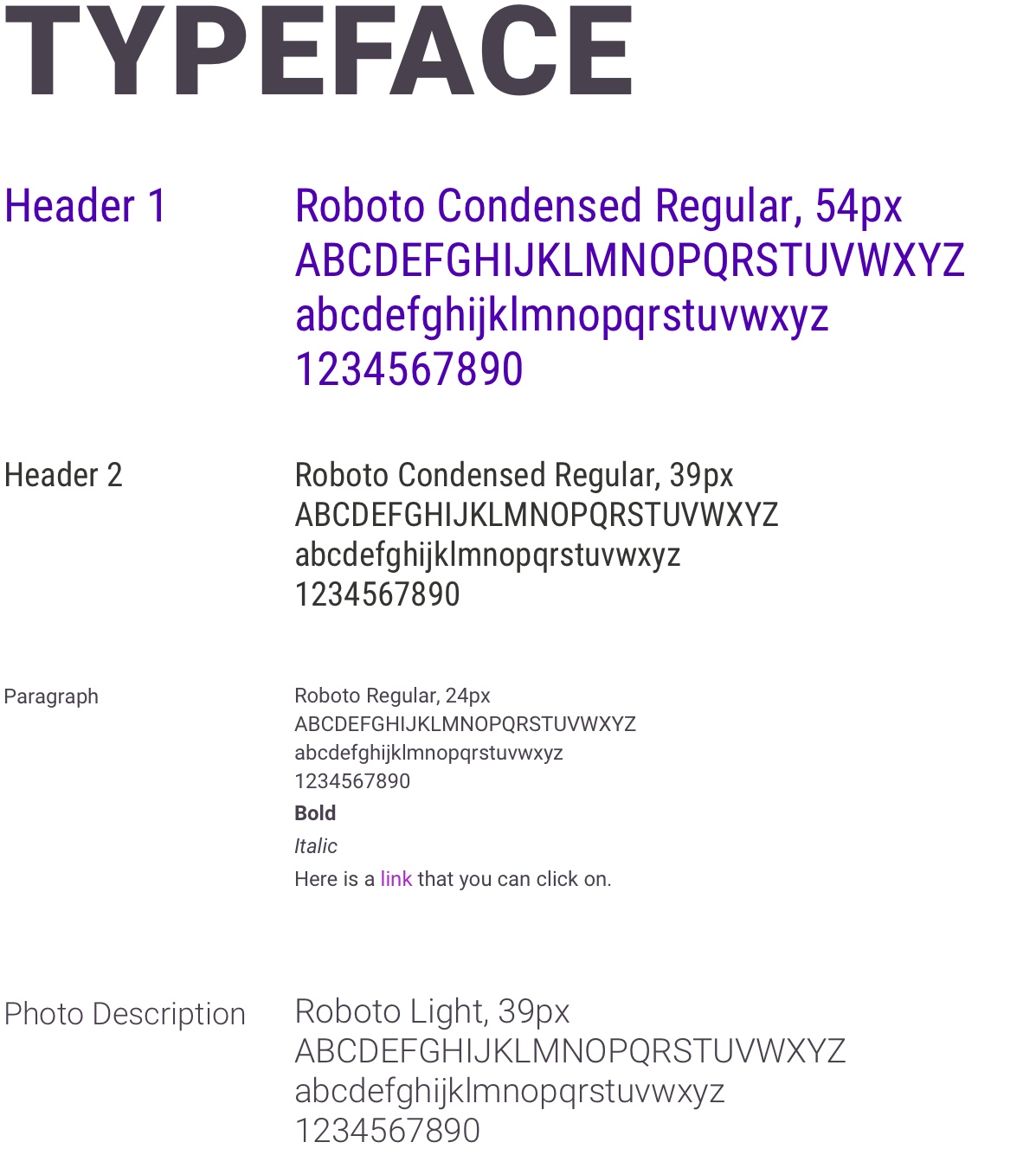
For the typeface, I chose Roboto for its modern style, versatility, and readability, especially for large blocks of text.
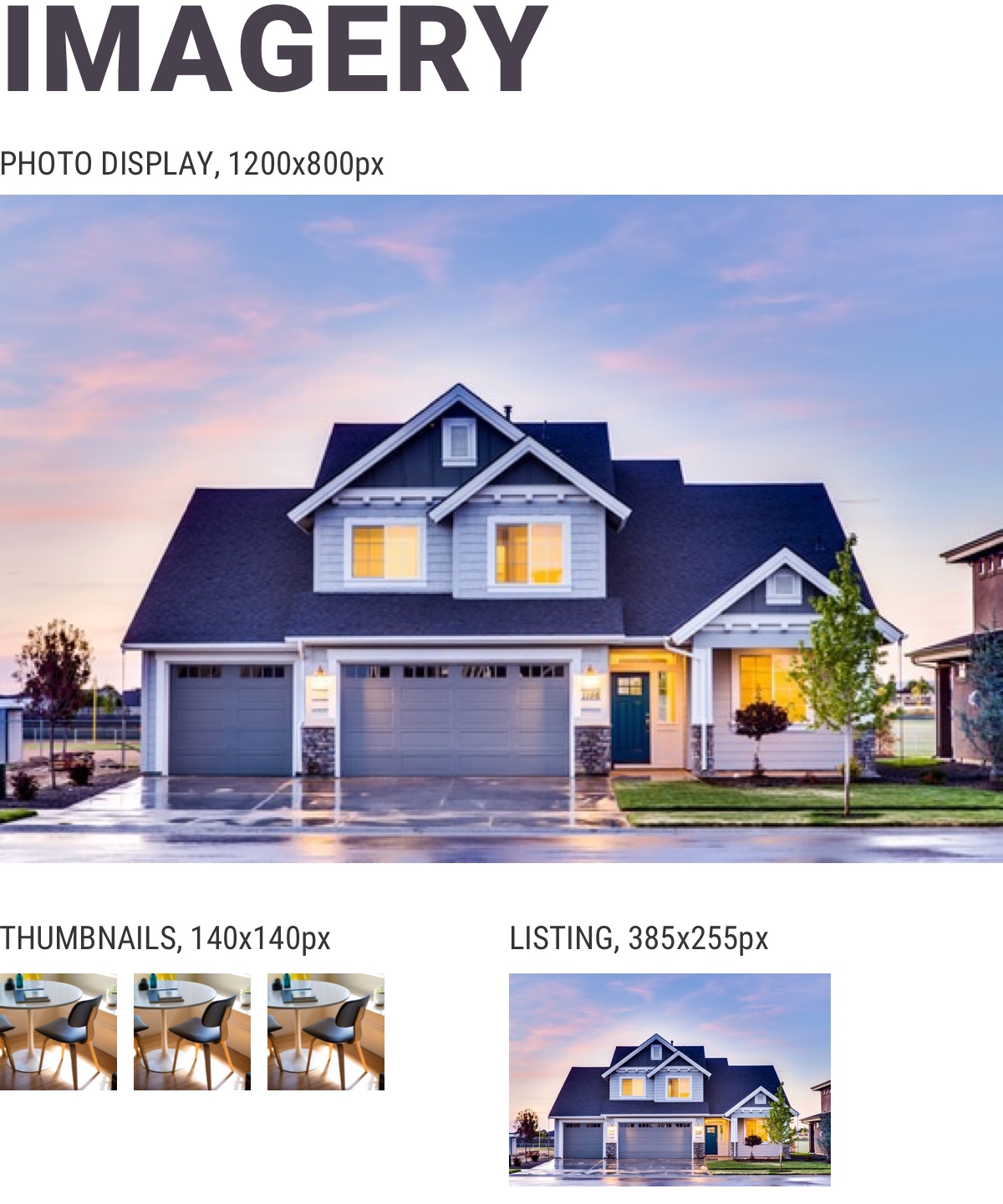
Sample Usage
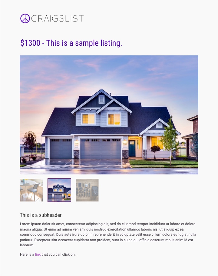 Example of how visual elements would be used after rebrand.
Resources
Deliverables
Articles
- How Craigslist’s Founder Realized He Sucked as a Manager - by Jon Fine, Inc.
- What Did We Learn From the Dotcom Stock Bubble of 2000? - by Ben Geier, Time Magazine
- 55+ Questions to ask when designing a logo - by Preston D Lee, Millo
- Stakeholder Interview Template - UX Apprentice
- A Stakeholder Interview Checklist - by Kim Goodwin, Boxes and Arrows
- How to create a brand style guide - by Shirley Chan, 99designs Blog
