Redesigning Facebook's iOS User Flow
The Challenge
Design a new sign up user flow for Facebook’s iOS app in 24 hours.
Table of Contents
- Facebook’s Original User Flow
- Questions & Potential Issues
- Research
- Strategy
- New User Flow
- Resources
Facebook’s Original User Flow
Mobile Screenshots and Flow
I tested the on-boarding user flow for New Users on Facebook’s iOS app and took screen shots as I went. I placed them on in a visual flow for me to reference as I mapped out their User Flow.
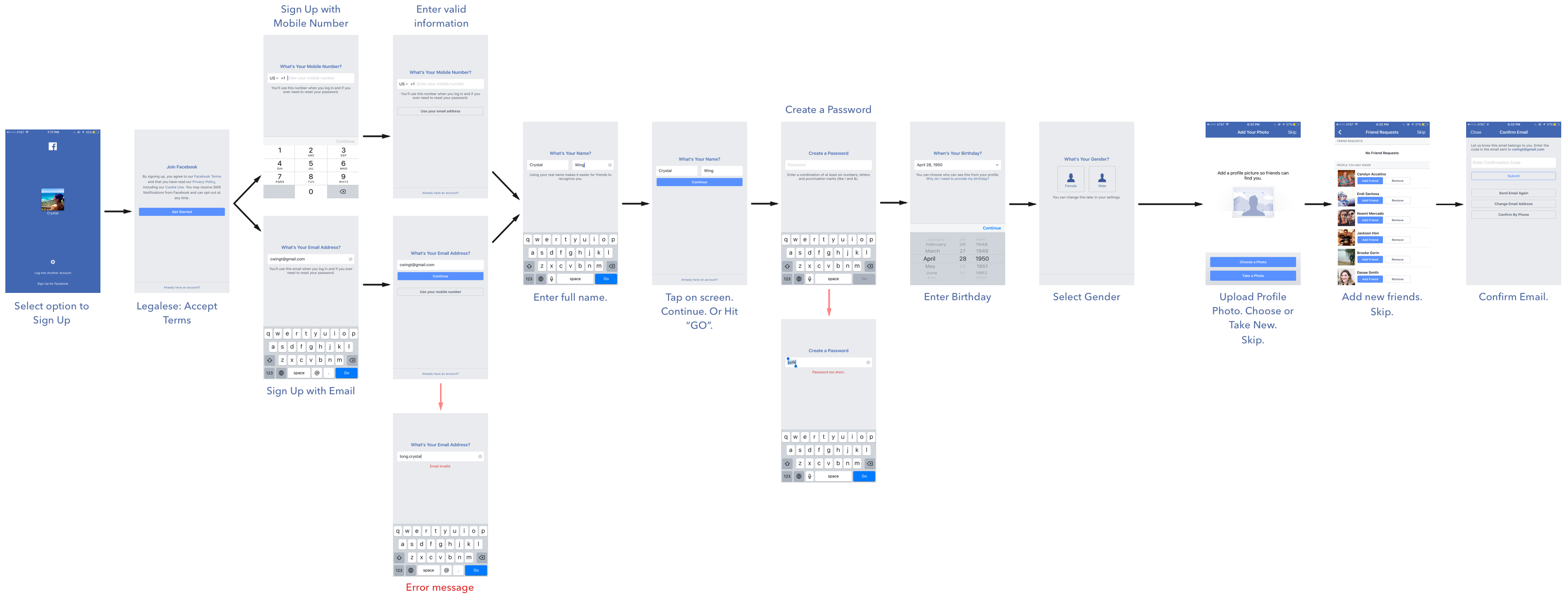
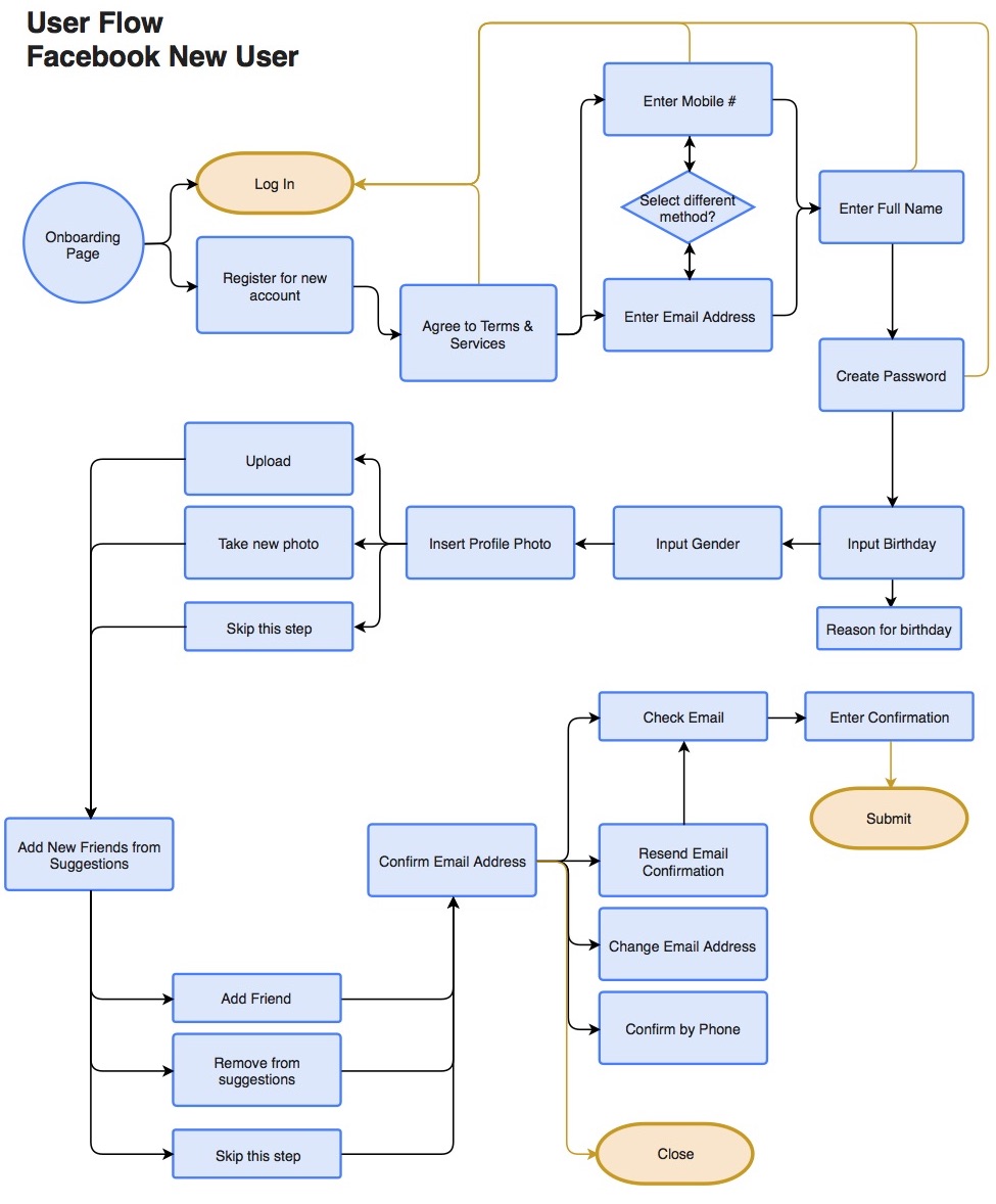
User Flow Diagram
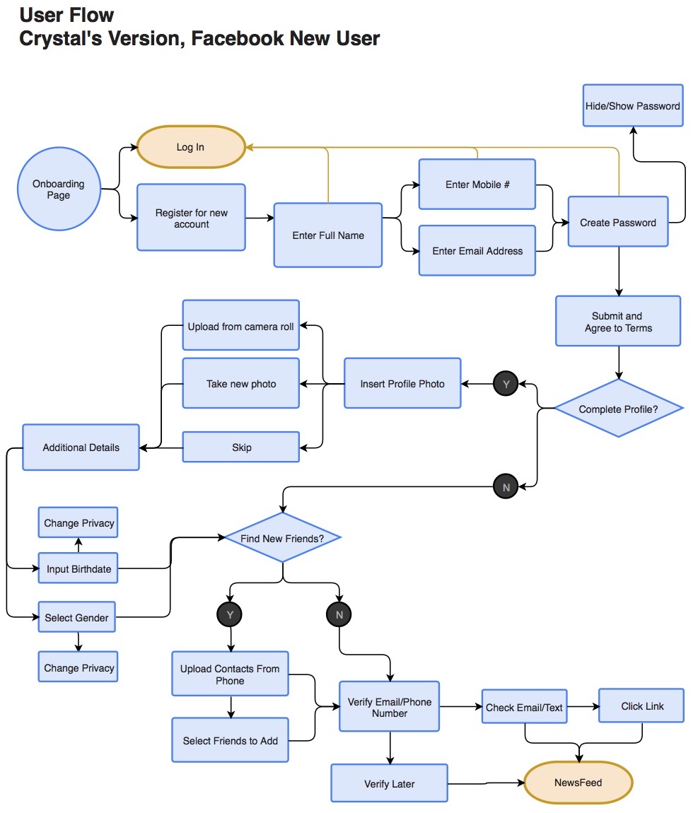
Using draw.io and the visual flow (pictured above), I mapped out the user flow for New Users:
Questions and Potential Issues
Here are potential problem spots and questions that I came up as I tested the on-boarding process and mapped their user flow.
- Feels like there are many steps, and there is no progress bar. Would adding one be beneficial? Or is there a better way?
- It takes an extra step to tap on screen to find
CONTINUEbutton. - Does the
GObutton do the same thing asCONTINUE? - There is no
BACKbutton. Would adding one be beneficial? - Why is there no
CANCELbutton? - Why is birthdate necessary? Would privacy option be beneficial?
- Why is gender necessary? And why are there only two options, Female & Male?
- Would privacy options be beneficial when inputting birthdate and gender?
- Cannot hide password. :(
- It takes an extra step to move between mobile and email input. Would it be more beneficial to place both on same page?
- Where are these friend suggestions coming from? Are they even useful if they don’t have any information from me? Do I have to search for my friends one at a time via their names?
- On email confirmation, how useful is it to have additional options such as: – change email address – confirm by phone
Research
In this phase, I investigated the importance of and best practices for signups, forms, and their flows. See resources I used at the end of the case study.
Why do we care about details of sign-ups and forms?
Conversion and drop-off rates!
What can go wrong?
- Trust can be an issue. People are afraid of being spammed, or that their personal information will be manipulated.
- The form takes too long or is difficult to understand
- Users give up fatigue.
- Users don’t understand why certain information is required, again leading to the issues with privacy and trust.
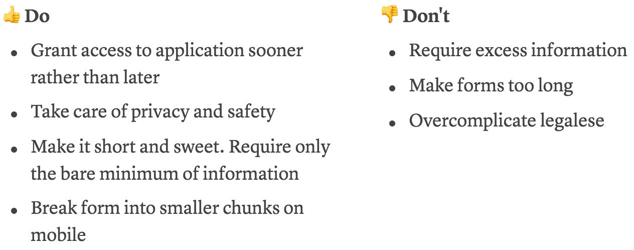
The Do’s and Don’ts
Smashing UX Design on Forms
General Notes
- Complete form in as little time as possible
- Understand how to understand questions correctly
- Provide bare minimum of information
- Trust that their personal details are in the safe hands
- Complete form in one go without have to come back later with additional information.
- Use a vertical layout
- Clear CTA
- Clear labels
- Differentiate labels from text
- Use reasonable defaults
- Show progress
- In-line validation
- Mobile forms need to be easier than desktop counterparts. Simplify them!
- Break form into smaller chunks.
Common mistakes
- Harsh Error notifications. Be polite.
- Inflexible input data formats
- Not generating specific and helpful messaging
- No inline validation as user progresses
- Too many questions
- Too much legalese
Strategy
After gathering data from testing and research, I brainstormed user stories and considered business requirements.
User Stories
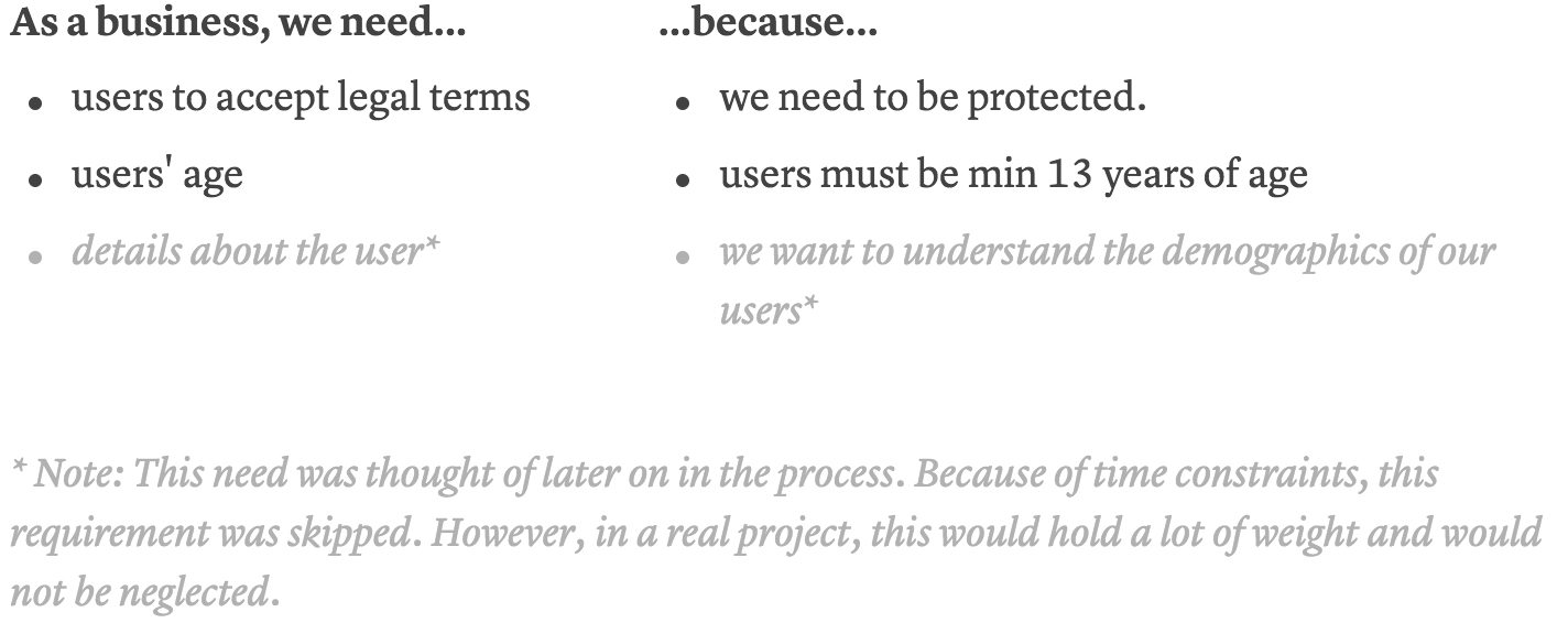
Business Requirements
New User Flow
Below, you’ll see the new user flow. Here is what changed:
- Name input moved to beginning of flow. It has potential to be more welcoming than being presented with Terms of Services immediately. This would need to be tested.
- Originally, Selecting between mobile and email address took an extra step. This was removed on the theory that less steps is more. This would need to be tested.
- An option to hide and show password was added for user’s feeling of safety and security. This is especially important if registering in public.
- To make it a quicker process, users are given the option to complete their profile. If this project were to continue on, users would be informed of the benefits of doing so, and encouraged to finish.
- The option to find friends via contact information alleviates the huge task of adding friends. We want to do the work for the user as much as possible.
- For email/phone confirmation, I removed the option to change email address and verify by phone. Further testing would be needed here.
- MISSING FROM USER FLOW: option to resend confirmation email/message
Resources
- Designing UX Login Form and Process - UX Planet by Nick Babich
- UX Flows: How to Craft Effective Sign-ups by MK Cook
- 10 Ways to Present Legal Terms at Sign-up by Amber Ferrari
- Book: Smashing UX Design by Jesmond Allen & James Chudley
Fin.
